Cluster Analysis
We ran memeseed and memeincrement on six months of data (1/1 - 7/8). We used data from February onwards for analysis.
Between this Monday's analysis and now, we have been working hard to further improve cluster deletion so spammy clusters and dead clusters are properly deleted and archived. We have also increased the amount of information we store for deleted clusters. This week we focused on taking a look at the updated results, as well as using the new data to create even more plots. Yay!
All Clusters
Histograms!
I know histograms aren't technically the most interesting, but they are still sometimes necessary. To see a more hi-res version of the graphs, just click on the images. :)
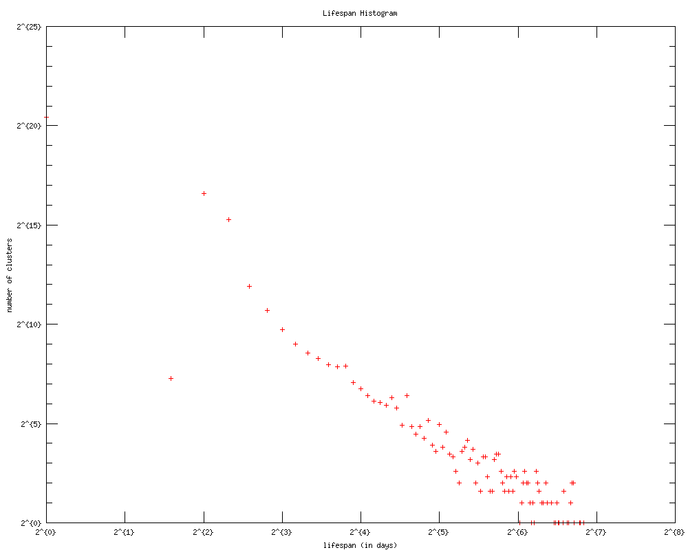
Histogram of cluster lifespan. There is still a power law distribution. Note how the tail end looks so much cleaner than the one from earlier! This shows that our attempts to improve cluster deletion/archival have been generally successful! :)
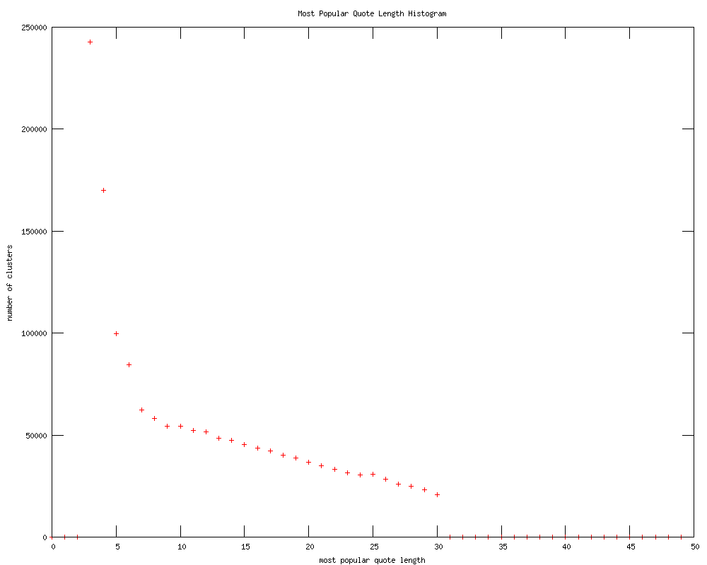
Histogram of the length of the most popular quote for each cluster. We think the curve is quite interesting! It would almost be a power law distribution, we think, were the tail end not so linear.
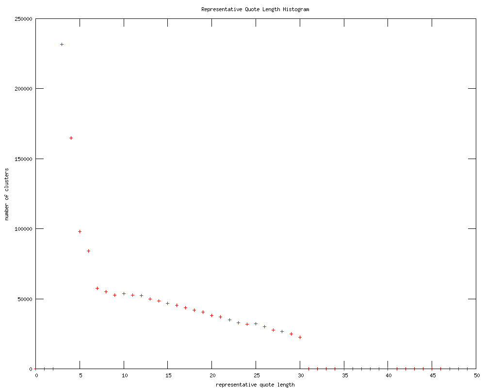
Histogram of the length of the representative quote for each cluster. Note how it is very similar to the previous plot, except there are a few more clusters with longer length. As the representative quote is longest, this makes sense.
Length vs. Lifespan
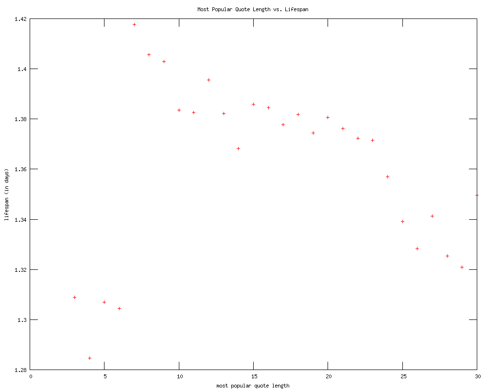
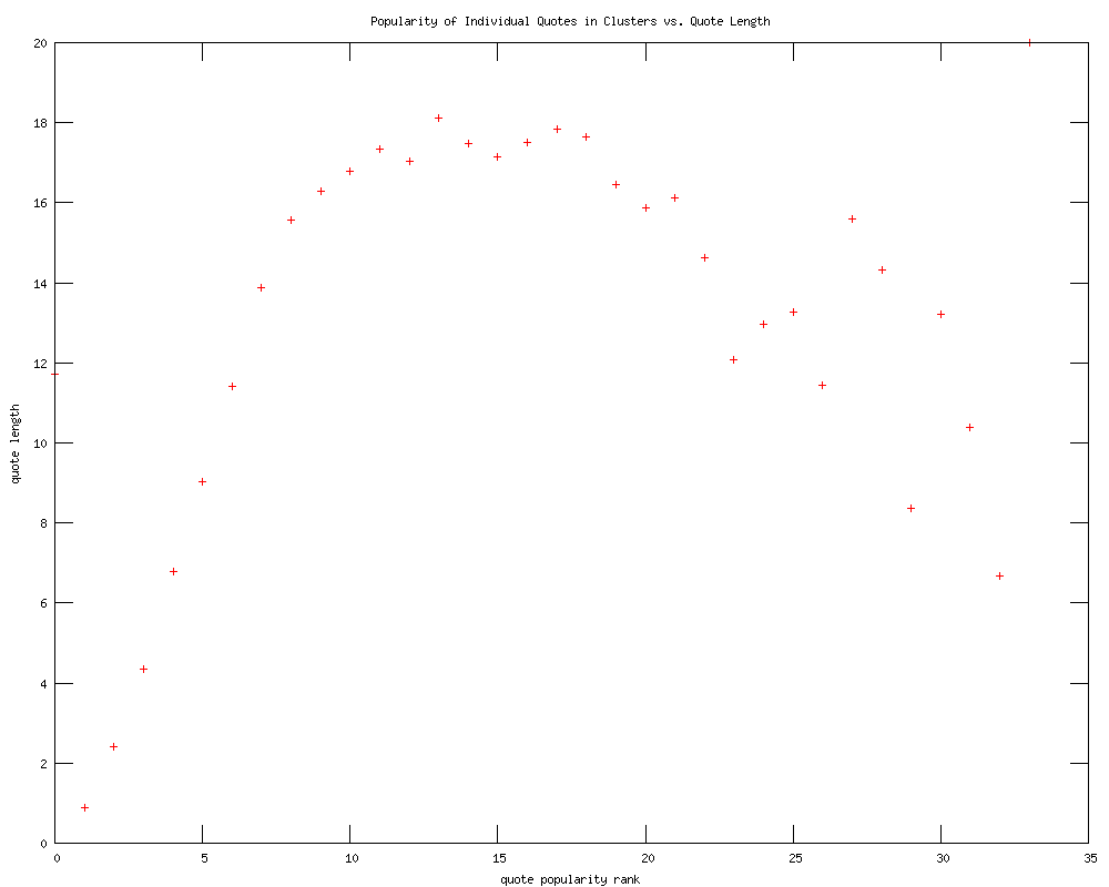
Most popular quote length versus cluster lifespan. We are quite confused by what happens at the 5-word mark to make such a big difference.
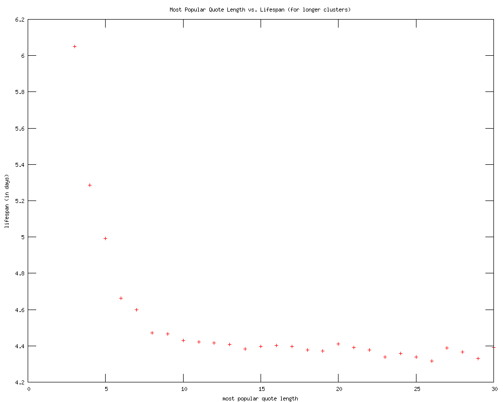
In this graph we got rid of all clusters with lifespan lower than three days. This is because one metric for cluster deletion deletes the cluster if it has fewer than 20 sources in the last three days. Interestingly, the graph looks much more mathematical!
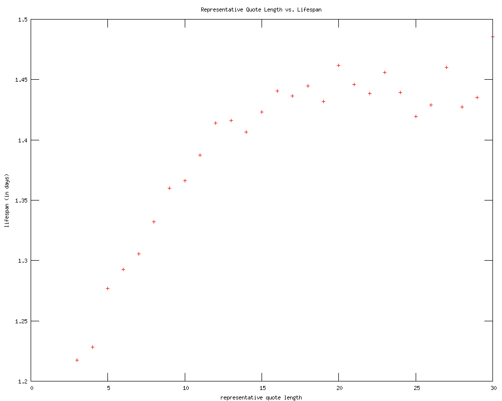
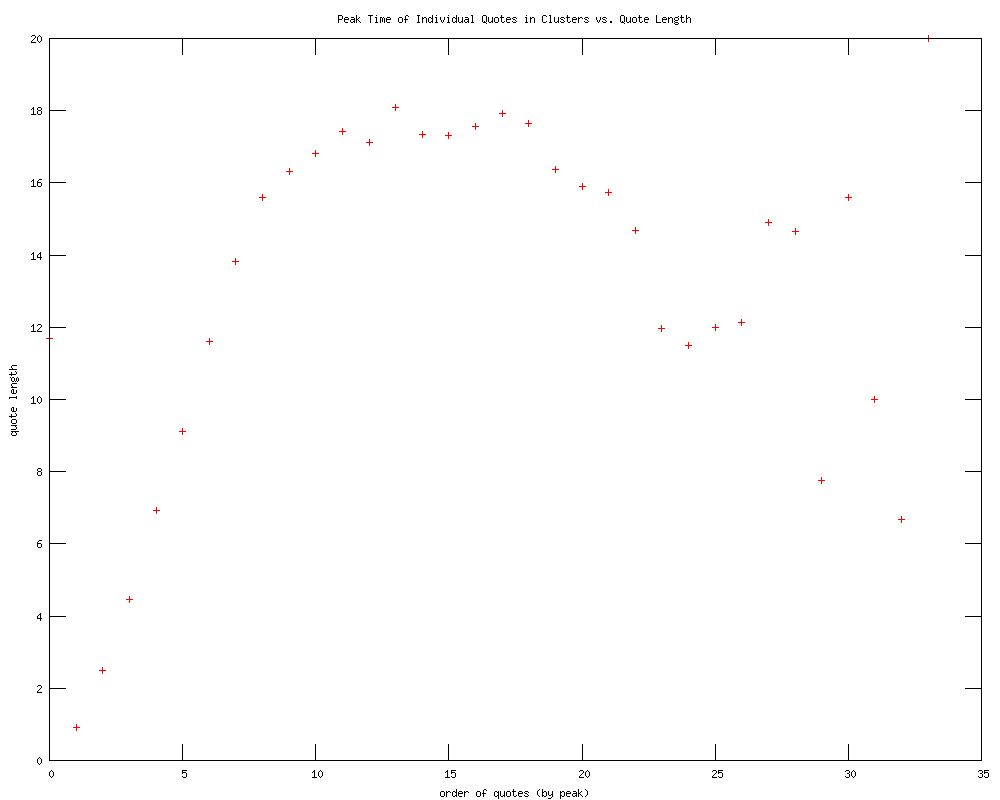
For fun, we re-plotted representative quote length versus cluster lifespan. We find it quite interesting that lifespan rises with increased representative quote length but falls with increased most popular quote length. The latter point makes intuitive sense becuse humans are more likely to remember short phrases.
Other graphs
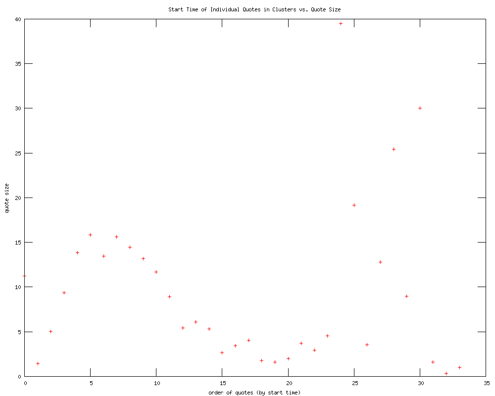
We went through and re-ordered each clusters's quote by start time, i.e. the first instance in which that quote shows up. Then we averaged the number of mentions for the first quote that shows up across all clusters, second quote, etc. etc. This is the result. The values on the y axis seem rather low, so we will try this on popular clusters only next.
Top clusters
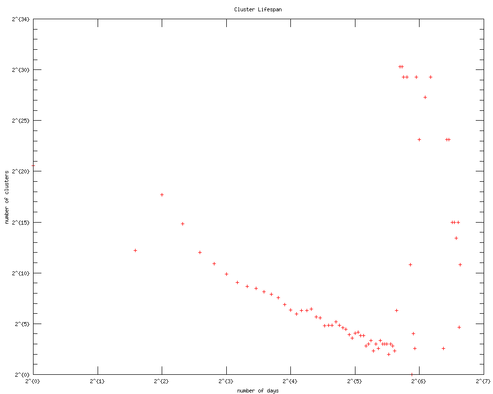
We ran many of the same tests on top clusters that were deleted (i.e. more than 350 sources). The results can be found here - we're not quite sure what analytic conclusions can be really drawn from this yet, if ever.
We think that a better idea may be to calculate quantifiable numbers (average cluster variance, etc) and compare that with non-top clusters, instead of plotting the data.
For example, we can see from looking at the graphs that no top cluster has a lifespan of less than five days. Awesome!
Future Steps (for analysis only)
Figuring out how to make this: http://memetracker.org/images/quote-005.png in gnuplot, or at least finding where the code is.
A more thorough look into the properties of quotes that show up first in a cluster or peak first, etc. by looking at individual clusters.
Other ideas, such as Christian's n-grams.
Besides this, we are of course still working on the nice daily runs/output, as outlined in Pong's document. And in the very short term, we have a CURIS poster to make and print! :)