The ability to measure time accurately over very long periods and very short intervals has been and remains crucial to the development of modern science. In additional to standardizing three naturally occurring units of time-measurement: the day, month and year, we have invented hour, minute, second, and smaller time scales for scientific measurement. In modern computer science, we measure Input/Output (IO) time, memory access time, and processor speed, in milli, micro, and nano seconds.
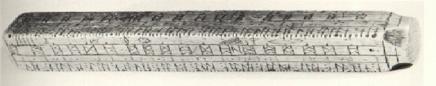
Related dimension of scientific measurement is space. Spatial attributes such as distance and volume must be measured with precision. We can also measure space in time or time in space. For example, measuring distance traveled in time by an object, we can compute its average speed. On the other hand, space can be used to record or represent time. The almanac shown in Figure 1, called a clog almanac, is a piece of 3D boxwood. with the times of the season changes carved on it.
Perhaps most important is the ability to discern spatial patterns in time. The discovery of gravity, the shape of earth, and many other natural laws, all resulted from the discovery of certain spatio-temporal relationships. Likewise, many algorithms that assist our daily life, for example, in traffic control, inventory management, investment planning, and the internal operations of computers, involve tradeoffs of space and time. To discover and gain insight into spatio-temporal relationships, we need the assistance of intuitive tools for spatio-temporal visualization.
This study focuses on a particular spatio-temporal relationship - the flow. A flow consists of an object or objects moving in time from one spatial coordinate to another. For instance, river is a flow of water on the ground; clouds are water streams in the sky. In our culture, we have also created traffic flows, data flows, and the like. This study uses multimedia data streams as the flow example. We describe the characteristics of a video stream, and show how sand glass, as a visualization metaphor, provides more insights into the video bit streams.
The rest of this paper is organized as follows.
Section 2 describes the characteristics a video data flow.
Section 3 examines some possible visualization metaphors for flows.
Section 4 proposes using sand glass as the visualization
metaphor. Finally, Section 5 shows an implementation
that uses sand class metaphor to visualize
different video stream delivery algorithms.
 TR: the disk's data transfer rates.
Mem_Avail: the system's available memory.
N: the number of stream requests.
Each request is denoted as R_1, R_2, ..., R_N.
Each stream requires a display rate of DR (DR < TR).
DR can also be treated as the minimum network
data transmission rate.
TR: the disk's data transfer rates.
Mem_Avail: the system's available memory.
N: the number of stream requests.
Each request is denoted as R_1, R_2, ..., R_N.
Each stream requires a display rate of DR (DR < TR).
DR can also be treated as the minimum network
data transmission rate.
In addition, a multimedia delivery system has the following tunable parameters. They can be adjusted, within certain bounds, to optimize system throughput.
T: the period for a full disk scan.
T must be large enough to accommodate
the maximum number of streams we expect to handle.
S: the segment size, the number of bytes read
for a stream with one contiguous disk IO.
N_Limit: the maximum number of concurrent requests
the system allows.
In a feasible system, the amount of data retrieved in a period, S, must be at least as large as the amount of data displayed. That is, S >= DR * T. However, if we want a stable system, the input rate should equal the output rate to avoid accumulating more and more data in memory with every period. Thus, we have the equation S = DR * T.
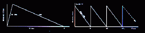
To visualize this system, we can use a two-dimensional plot. Figure 3 shows that the horizontal axis is time, and the vertical axis is the amount of data in the buffer for a stream. An IO starts shortly before the data staged into memory in the previous period is used up. The data accumulates in memory at the rate of TR - DR until the IO is complete. The data is then consumed at the rate of DR. This periodic behavior repeats until the playback ends, as shown on the right side of the figure.
Although the figure conveys information better than the text, the presentation is static if not dull. In fact, time is treated as another spatial dimension in most presentations. Although this results from the limitations of the presentation media such as papers and terminal screens, we believe there are more intuitive ways to show spatio-temporal relationships. This belief has prompted us to search for visualization metaphors that better represent flows.
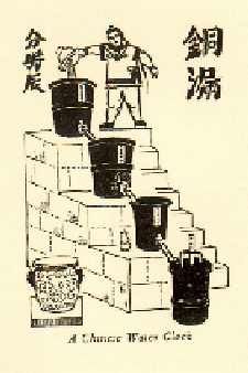
Figure 3 shows a water clock. Not so very long ago there were still some of these old-fashioned water clocks to be seen in China. Four big copper kettles were arranged, one below the other, on the steps of a stone staircase. The water ran from one vessel down into the next. Every two hours the guard hung out a little sign board showing what ``tee'' (2-hour unit) had passed. Since water needed to be refilled every now and then, water clocks were considered inconvenient. Nevertheless, as a visual metaphor, the water clock shows not only time, but also the relationship between volume and time.
Using the water clock as a visualization metaphor, we can view memory as a copper kettle that contains data. The narrow vessel that connects the kettles is the the data consumption channel. Adjusting the throttle of the vessel changes the data flow rate. A multi-staged water clock is a good representation of the data flow in the networks. Each kettle can be treated as a router's buffer. The data flows into a kettle and is then distributed to the downstream kettles.
Although the water metaphor is good for representing flows, it is not suitable for presenting a mixture of information. For many simultaneous streams flowing in the multimedia delivery system, for example, it is hard to attach attributes, such as colors and textures, to water to distinguish individual objects. When a yellow data flow is mixed with a blue one, water makes both flows green. Thus, the water metaphor can obscure micro information.
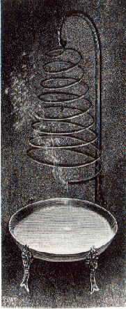 An alternative metaphor to the water clock is the candle clock.
A candle also shows the volume and time relationship well.
Small candles can be colored to represent each individual
object, while a large candle can represent
aggregate information. The burning
rate of a candle is the flow rate.
The candle clock, however, fails
to convey the feeling of flowing. Even though
a candle is consumed continuously, the sense of
its consumption is rather discrete, and constant too.
Moreover, the notion of ``replenishment'' does not pertain to
candle. We simply replace candle when
it is burnt out.
An alternative metaphor to the water clock is the candle clock.
A candle also shows the volume and time relationship well.
Small candles can be colored to represent each individual
object, while a large candle can represent
aggregate information. The burning
rate of a candle is the flow rate.
The candle clock, however, fails
to convey the feeling of flowing. Even though
a candle is consumed continuously, the sense of
its consumption is rather discrete, and constant too.
Moreover, the notion of ``replenishment'' does not pertain to
candle. We simply replace candle when
it is burnt out.
The movement of sand gives a sense of flowing.
Sand is replenishable.
One can adjust the channel between glasses to
reflect different flow rates.
One can color sand to represent micro information. Since
mixing sand dose not change
the original sand colors, the viewers can
zoom in a particular color of sand, sort sand by
colors, or see all sand as a whole.
Sand can show micro information without losing the macro
perspective, and vice versa.
Sand clock can have multiple levels.


 To view the composition of sand,
the viewer can display a sand pie or sand grid. In addition to
showing the percentage of a particular object in the
glass, a sand pie shows dynamically
the growth and shrink of the object. A
sand grid can show the object's location in the glass.
For instance, in inventory control or memory management
systems, it is often interesting to find out the
location of an object or a class of objects, and
probably their migration pattern in the 2D or 3D space,
to devise better space allocation strategies.
To view the composition of sand,
the viewer can display a sand pie or sand grid. In addition to
showing the percentage of a particular object in the
glass, a sand pie shows dynamically
the growth and shrink of the object. A
sand grid can show the object's location in the glass.
For instance, in inventory control or memory management
systems, it is often interesting to find out the
location of an object or a class of objects, and
probably their migration pattern in the 2D or 3D space,
to devise better space allocation strategies.
In the macro level, we would like to find out the maximum total memory space required by each algorithm. We are also interested in the variance of the memory requirement, so that we can decide if the memory requirement can be slightly less than the peak and not to jeopardize the real-time delivery constraint of the media data. In addition, we want to find out how different page sizes affect the memory requirement.
In the micro level, we want to ensure that the data supply for each stream is neither inadequate that causes ``jitter'', nor excessive that requires too much memory resource. Another important information is the startup delay of a request. Startup delay, we mean the time between a request arrives at the storage system, and the time the data is available in memory for display.
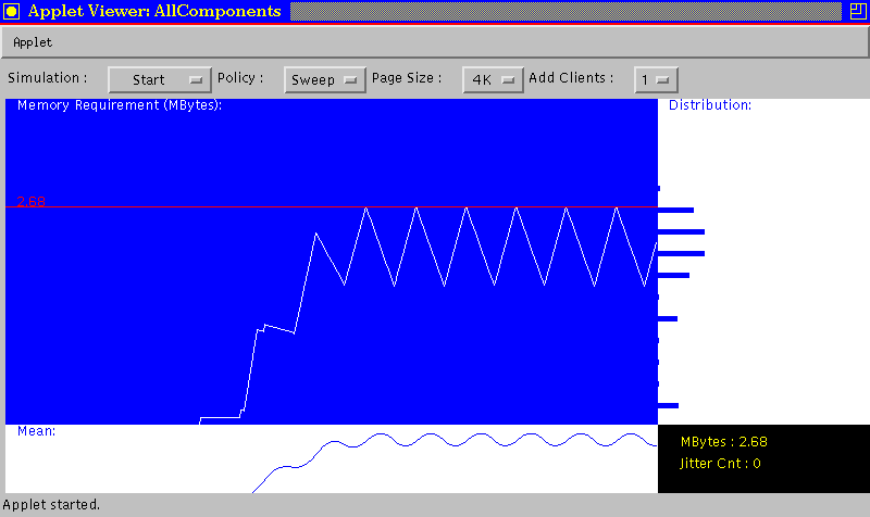
At the bottom we plot the average memory requirement. This is used together with the plot on the right hand side, the memory requirement distribution, to determine if the system can be configured with a memory capacity less than the peak memory required. Figure 6 reveals that the peak memory is required, although not constantly, in a regular manner. Therefore, having less memory capacity than the peak requirement can cause regular jitter on the display devices. Finally, the right bottom corner shows a summary including the peak memory requirement and total number of ``jitter''.
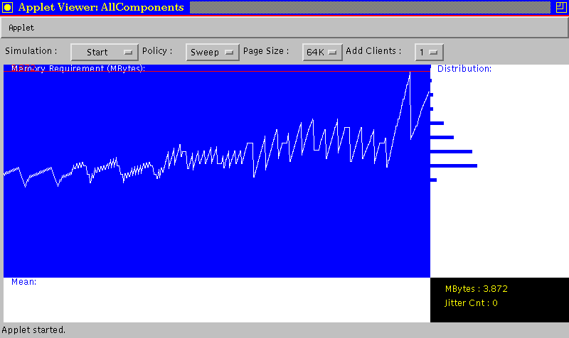
Figure 7 shows the memory requirement affected by the page size. Due to the quantization effect and internal fragmentation, the memory requirement increases as the page size increases from 4K to 32KBytes.
This 2D plot successfully displays the memory requirement and the pattern in time. Also, it reveals information such as the memory requirement versus page size. It is also capable of showing if memory or disk bandwidth is the resource bottleneck. However, information pertaining to the flow such as data replenishment and consumption speed, and the profile of the requests are difficult to tell. Attempts to change the 2D plot to incorporate new information such as the profile of the media data in memory would mess up this 2D plot. Therefore, we use a sand glass to compensate for the missing information.
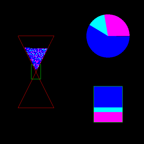
Finally, the rectangular shape at the right bottom describes the composition of the data flowing through the throttle. The size of the rectangle signifies the data flow rate, and each color can represent the flow rate of each movie, or data into a particular network router. This provides information for congestion control so that problem can be understood and alleviated with promptly.
In short, the macro sand glass complements the 2D plot in providing real-time information to make prompt management decisions related to load balancing and congestion control, while the 2D plot provides a historical prospective to assist the evaluation and comparison of different memory and disk management policies.
Another interesting information is the startup delay of a request. From the micro view, we can tell the time between a sand glass is created and the the first time the sand is filled into the glass. This time difference is the startup delay of the request.
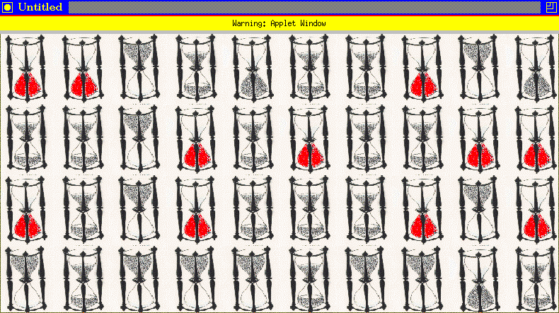
Finally, picking cone as the shape of the glass distorts
the real volume information from the viewers. When
a sand glass is half full, the volume of sand is probably
less than a third or a quarter full depends on the angle of the
cone shape. However, we feel this is precisely the
reason why sand glass is a good visualization metaphors:
it makes the viewer feel the urge and urgency
of replenishment. This sense of urgency grows more
than linearly as the level of sand becomes lower.
The actual volume information can be supplemented by the
2D plot.